Google Updates Visual Style for Communication Apps
A New Design for the Google Ecosystem
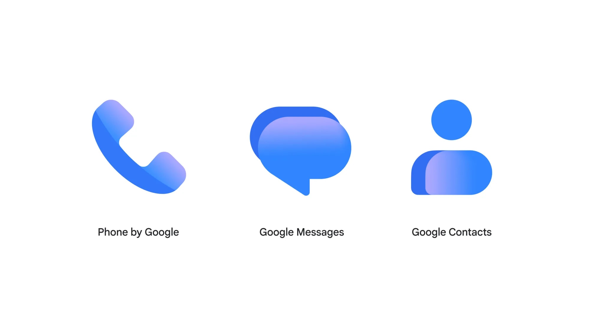
Google has officially announced a visual refresh for the icons of its communication apps: Contacts, Messages, and Phone. This change continues the redesign initiative for Workspace and Pixel applications that the company launched earlier this year. The goal is straightforward: to ensure all Google services adopt a unified, harmonious visual style.
According to the company, the new icons are clearer and easier to recognise. Designers have utilised refined yet vibrant gradients, which make the edges of the applications more distinct. While the core shapes of the icons remain, their curves and colour palettes are now fully aligned with Google's modern design language.
What Changes for Users?
It is important to note that this update is purely aesthetic. Google states that the functionality of the applications remains unchanged. Users will not need to learn new settings or adapt to interface adjustments. This is a strictly visual update aimed at giving your smartphone home screen a more modern and consistent look.
The updated design will appear not only on smartphones but also on web versions, including contacts.google.com and messages.google.com/web. With this, Google aims to ensure a consistent user experience across all platforms.
When Will the Update Arrive?
The new icons will roll out over the next few weeks via the Google Play Store. Users of the Google Messages beta version have already received the update, meaning the process has begun and will soon be reflected on all Android devices. For users who are active in the Android ecosystem, this update will be a pleasant visual improvement. While not a revolutionary technological leap, such details are important for enhancing the user experience. If your phone is set to automatic updates, you will see the new icons on your home screen in the coming days.